Wisewool
Revitalising Aotearoa’s wool industry by engineering nature’s cleverness
Work Completed
Discovery Workshops, Brand Strategy & Story, Brand Identity Design, Copywriting
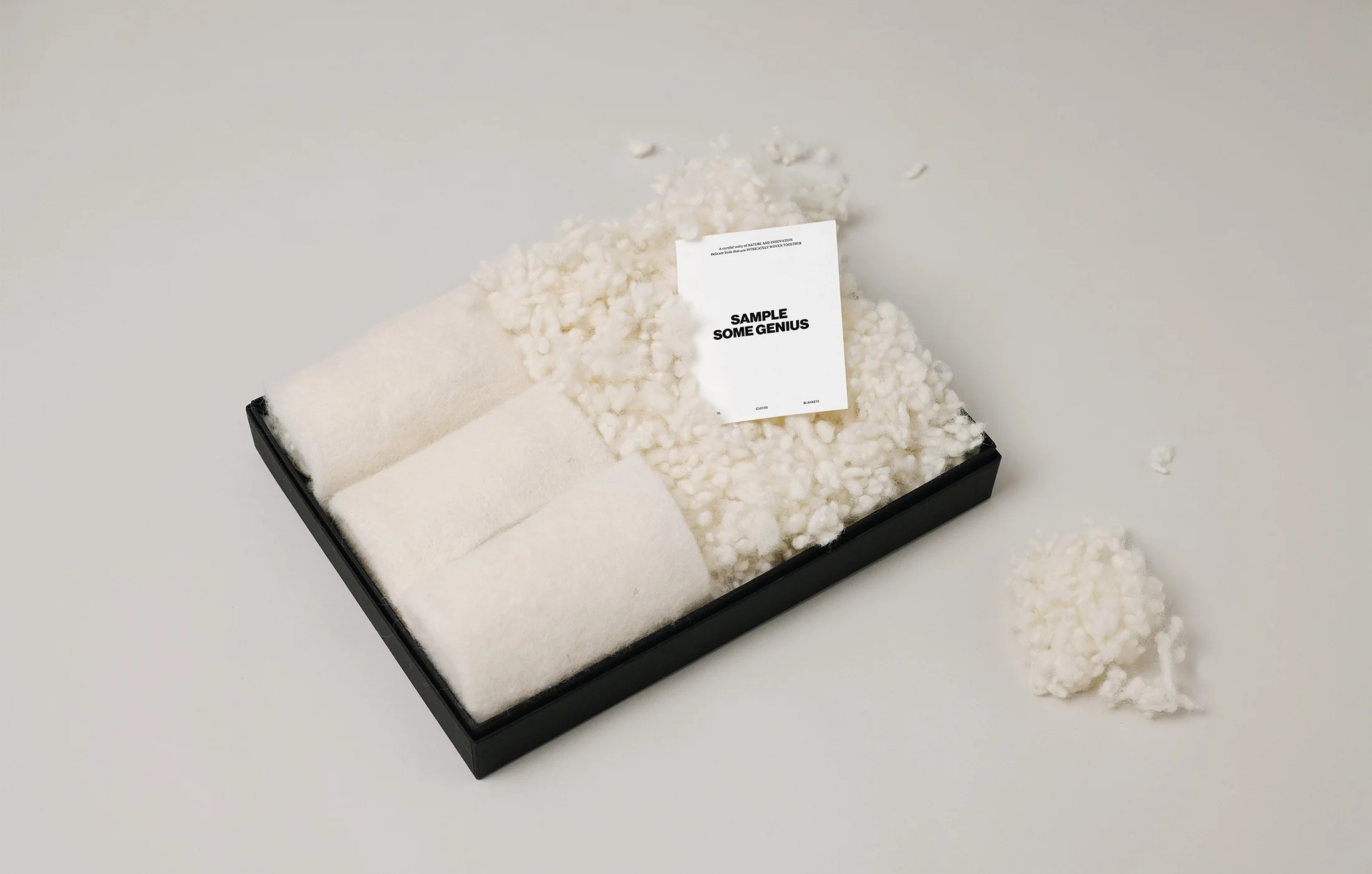
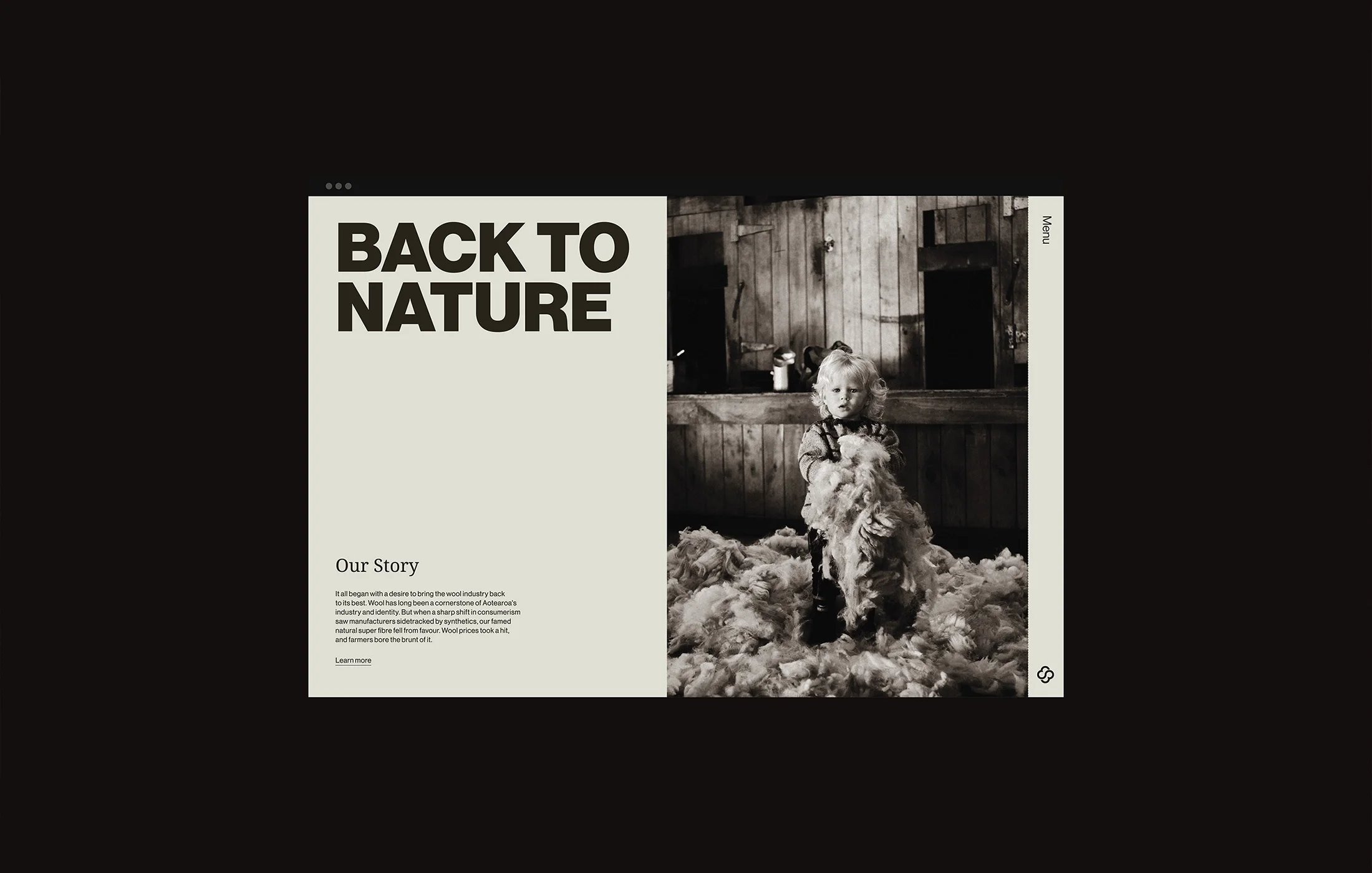
It all began with a desire to revitalise Aotearoa’s wool industry. Through a careful unity of nature and innovation, Wisewool was born; a revolutionary material of delicate, spring-like buds that are intricately woven from wool fibres. These remarkable buds enhance wool’s inherent buoyancy and durability while preserving its unparalleled natural qualities.
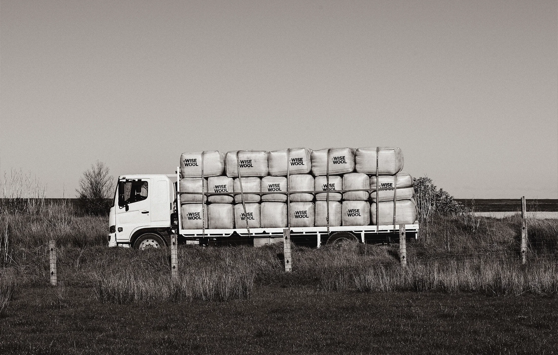
Wool has long been a cornerstone of Aotearoa’s industry and identity. But when a sharp shift in consumerism saw manufacturers sidetracked by synthetics, wool—a natural super fibre—fell from favour. Wool prices took a hit, and farmers bore the brunt of it.
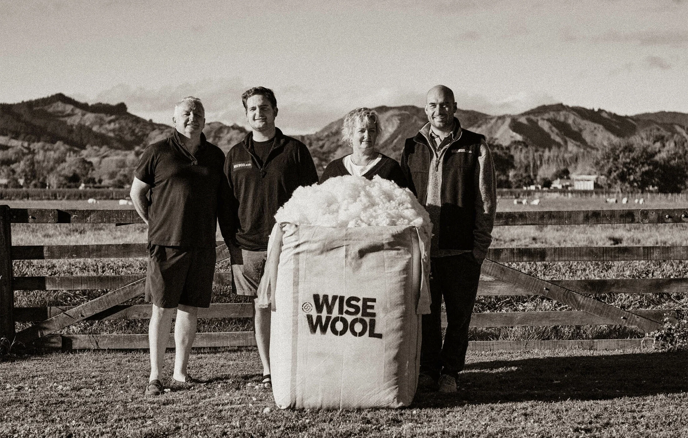
We had to do something. With five generations of wool handling in our family, we felt a responsibility to our whenua and community in Tairāwhiti, Gisborne. So we created a super wool: Wisewool. — East Coast Wools
Photography by: Patrick Hickley

The brand strategy sought to achieve one thing; to re-orient the legacy of this humble fibre to influence a new direction for the strong wool industry. Alongside the visionary East Coast Wools team, Richards Partners developed a strategy that positioned Wisewool as a luxury ingredient brand, transforming it into a symbol of exceptional quality, and an endorsement of the products it would live within.
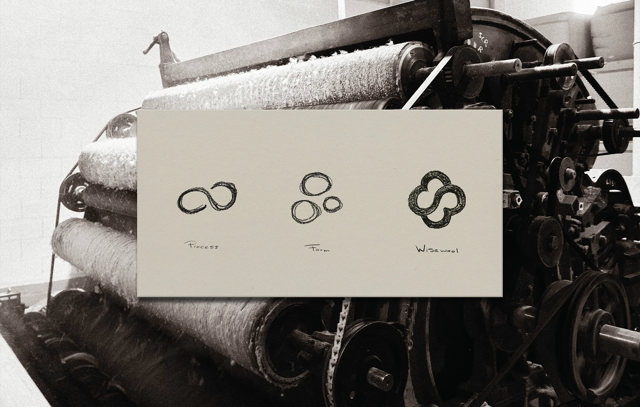
Recognising the significance of this repositioning, we understood the need for a visual identity that embodies courage and resilience, but also echoes the grace and sophistication of nature. Embracing this tension of opposites resulted in the creation of a sturdy, confident logomark; contrasted against a backdrop of delicate, elegant letterforms which serve as the body typeface. This created a unique visual voice for the brand, built on its central ethos.
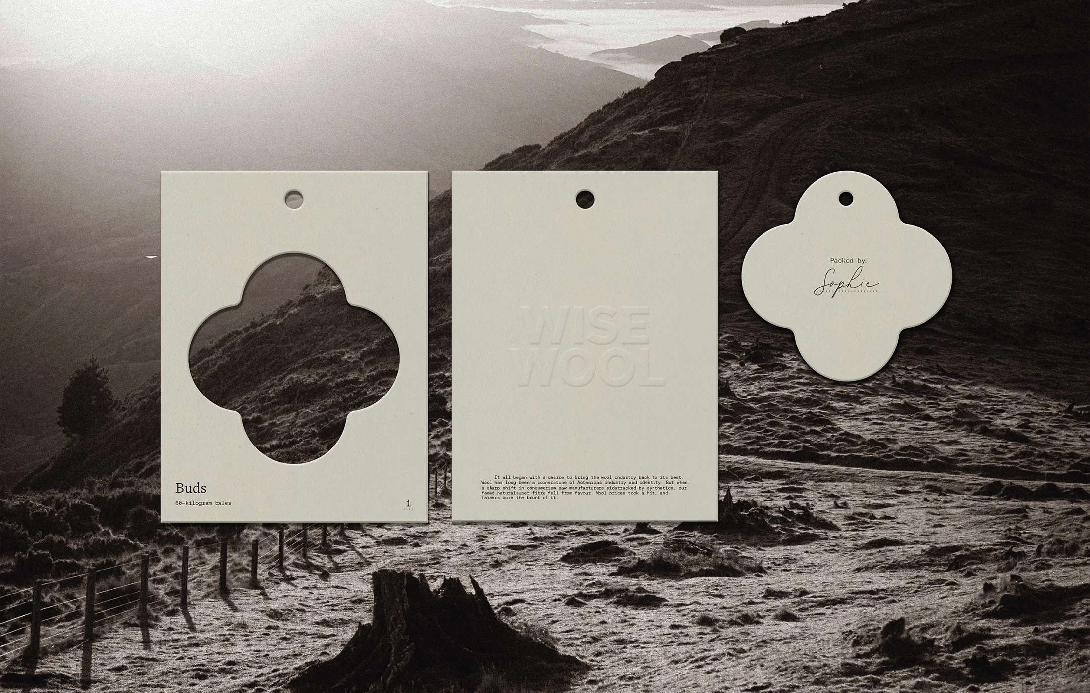
The Wisewool symbol encapsulates the intricate interwoven wool fibres and visually represents their physical connection as well as the cloud-like structure formed by the product. Drawing inspiration from the contours found in traditional family crests, the logomark depicts the essence of a historic emblem, paying homage to the brand’s history.
The end result is a luxury brand that reclaims wool’s stature as a high-value super-fibre, positioning Wisewool to enter a new era of premium ingredient branding.