Precinct
Telling the story of how Precinct shapes cities and how cities shape us.
Work Completed
Interviews, Insights & Opportunities Report, Discovery Workshops, Brand Strategy & Story, Employer Branding, Brand Identity Design, Iconography, Photographic Direction, Brand Guidelines, Website Design
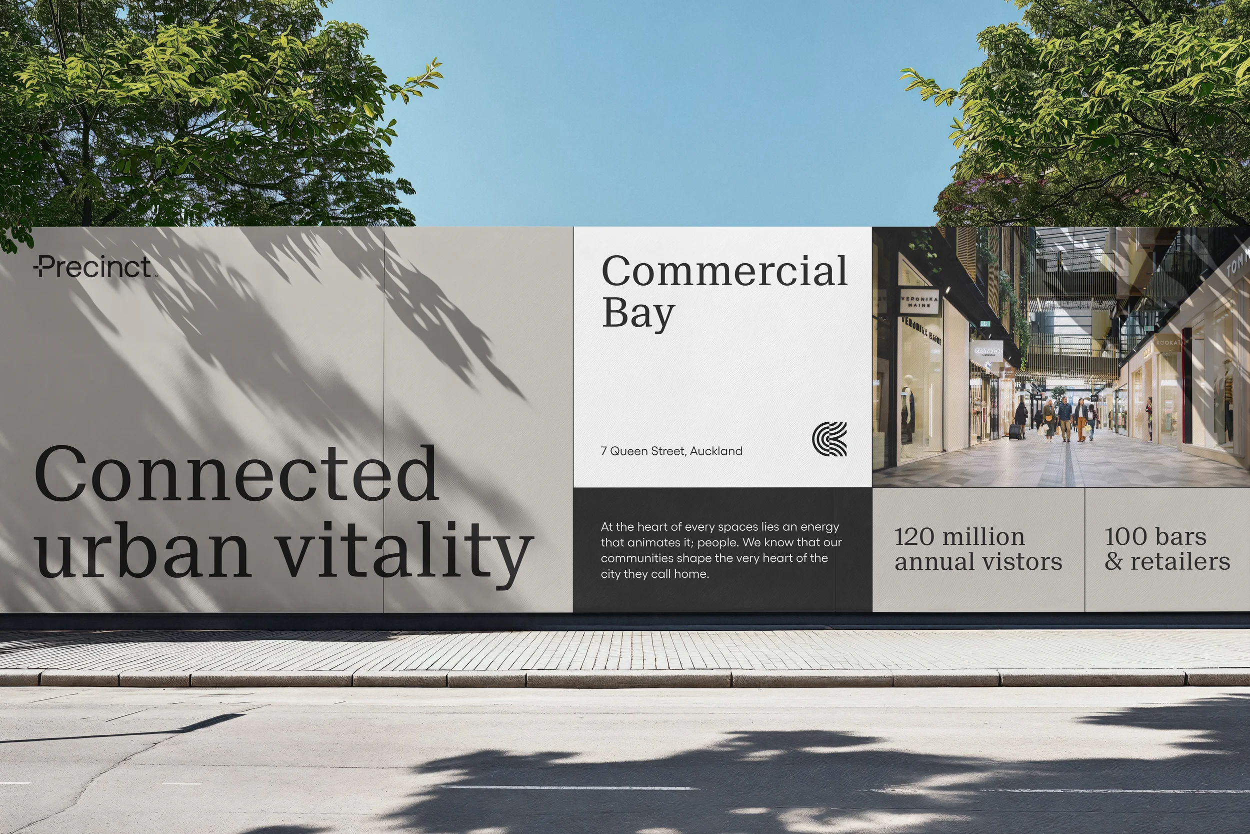
Precinct is the long-term owner, developer, and manager behind many of the buildings that define New Zealand's skylines. From Commercial Bay in Auckland to Bowen Campus in Wellington, they've long shaped the development and vibrancy of our cities
"Over the past five years, the business has gone through an evolution," began their brief. "It's a compelling story, but it hasn't been articulated... leading to a disconnect between what we're doing and what we're saying." Precinct is well-regarded for its premium office spaces, but with retail now in the portfolio and an impending expansion into residential, it was time for the brand to evolve with the business.
To tell their story, we conducted interviews and workshops with Precinct's leaders, staff, and customers. Our insight work revealed that as the scope of the Precinct expanded, both customers and staff shared a desire for a continuation of world-class standards across their mixed-use spaces and services.
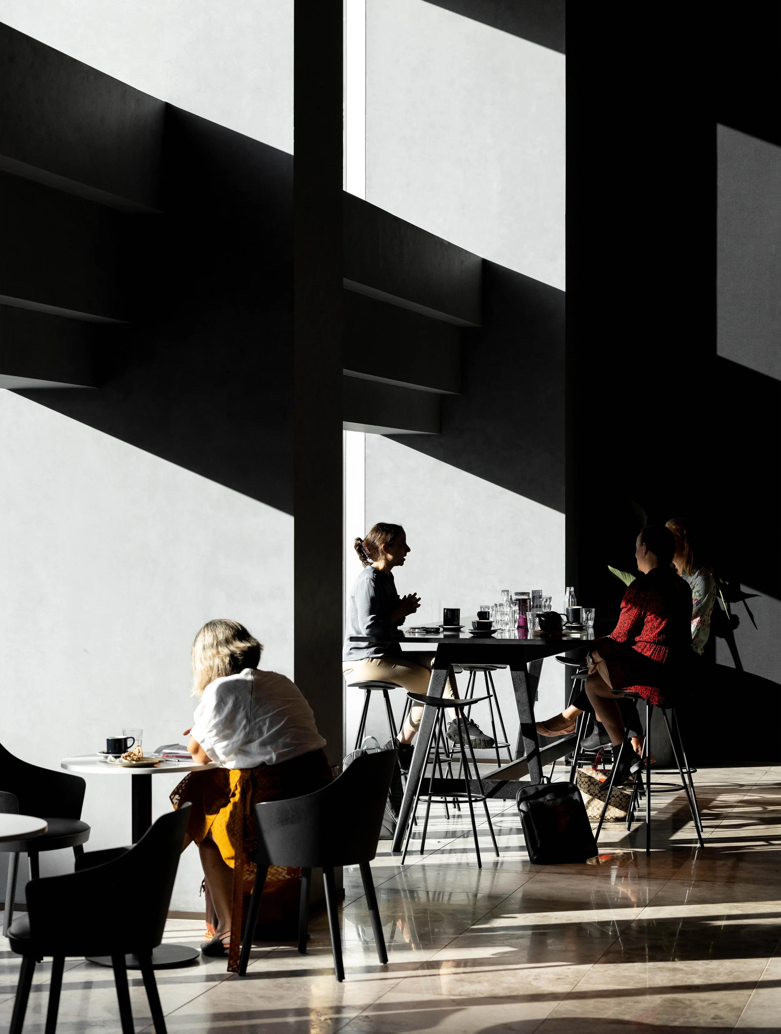
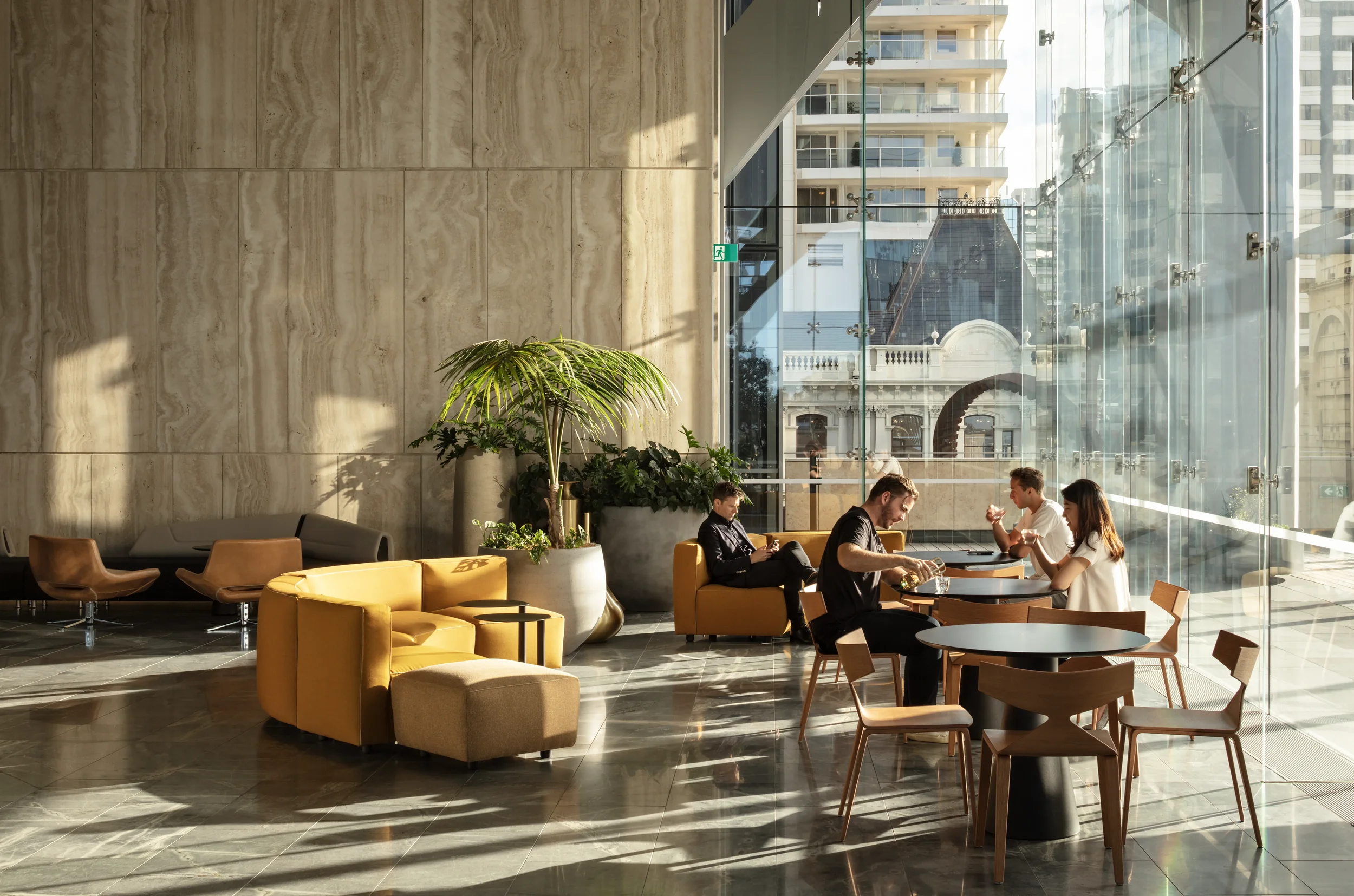
Through our conversations, it became clear that today's Precinct are shaping the cities of Aotearoa's tomorrow. Their scope extends beyond buildings and places. It's equally about the life, commerce, and energy those spaces enable.
Precinct's brand strategy and story hinged on two pillars; their ethos and their employer brand. In close consultation with their leadership team, we articulated their purpose, mission, and vision in a way that captured the spirit of their enterprise. "To enrich everyday lives by cultivating urban vitality and inspiring city life in Aoteroa."
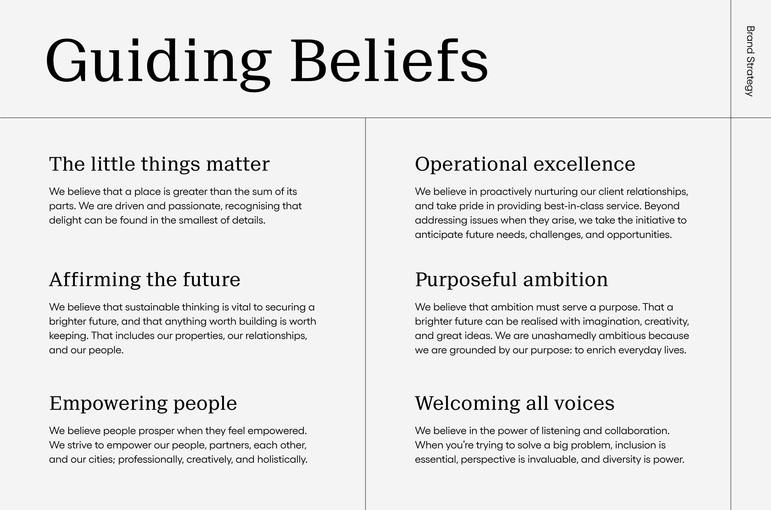
With ambitious projects on the horizon, Precinct sought to strengthen their employer brand to attract and retain the top-tier talent needed to deliver them. To ensure it reflected the organisation's character, we engaged their entire team of 80+ people through a survey and workshop. The result is a set of distinctive guiding beliefs informed by, and shared across, the people who make Precinct.
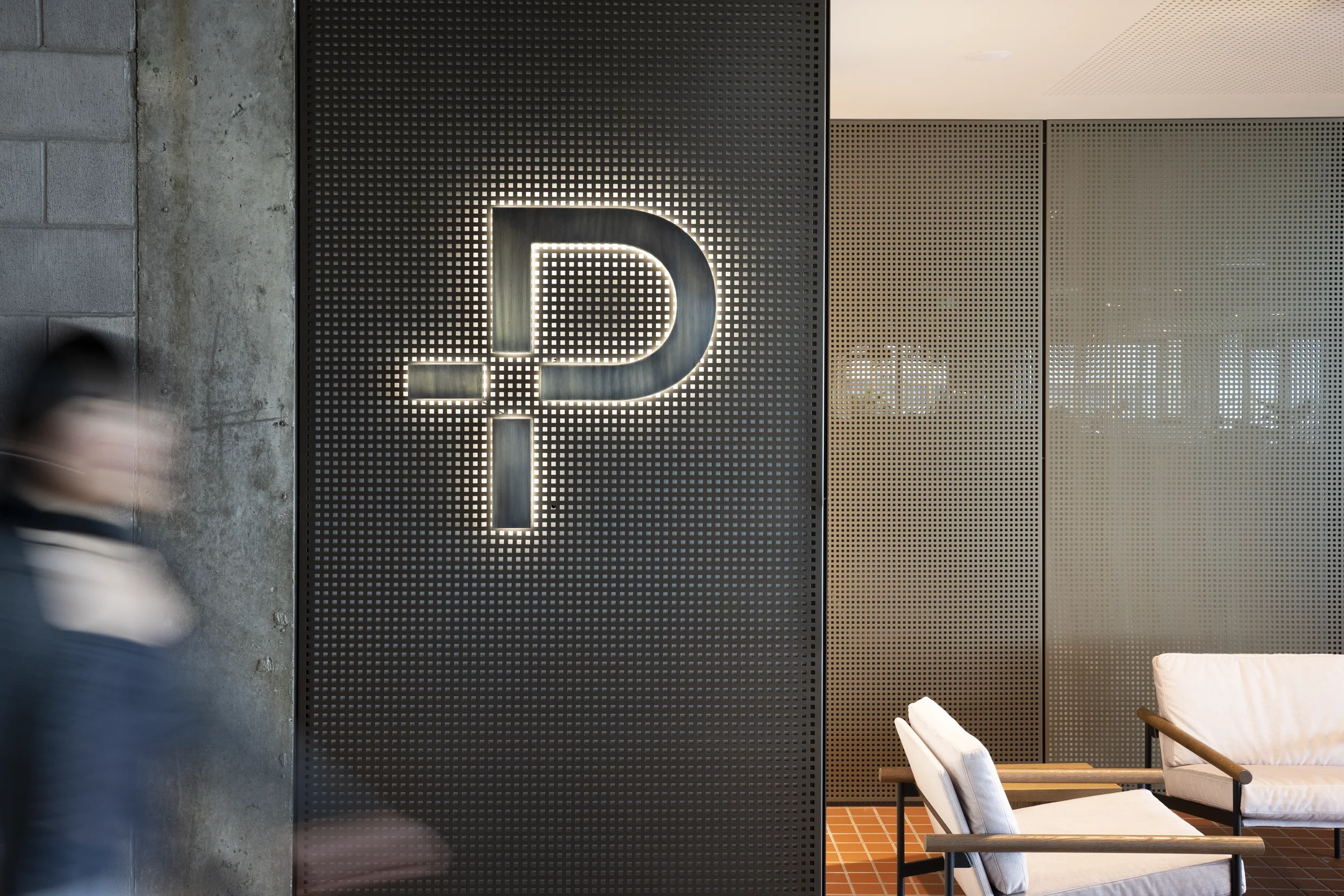
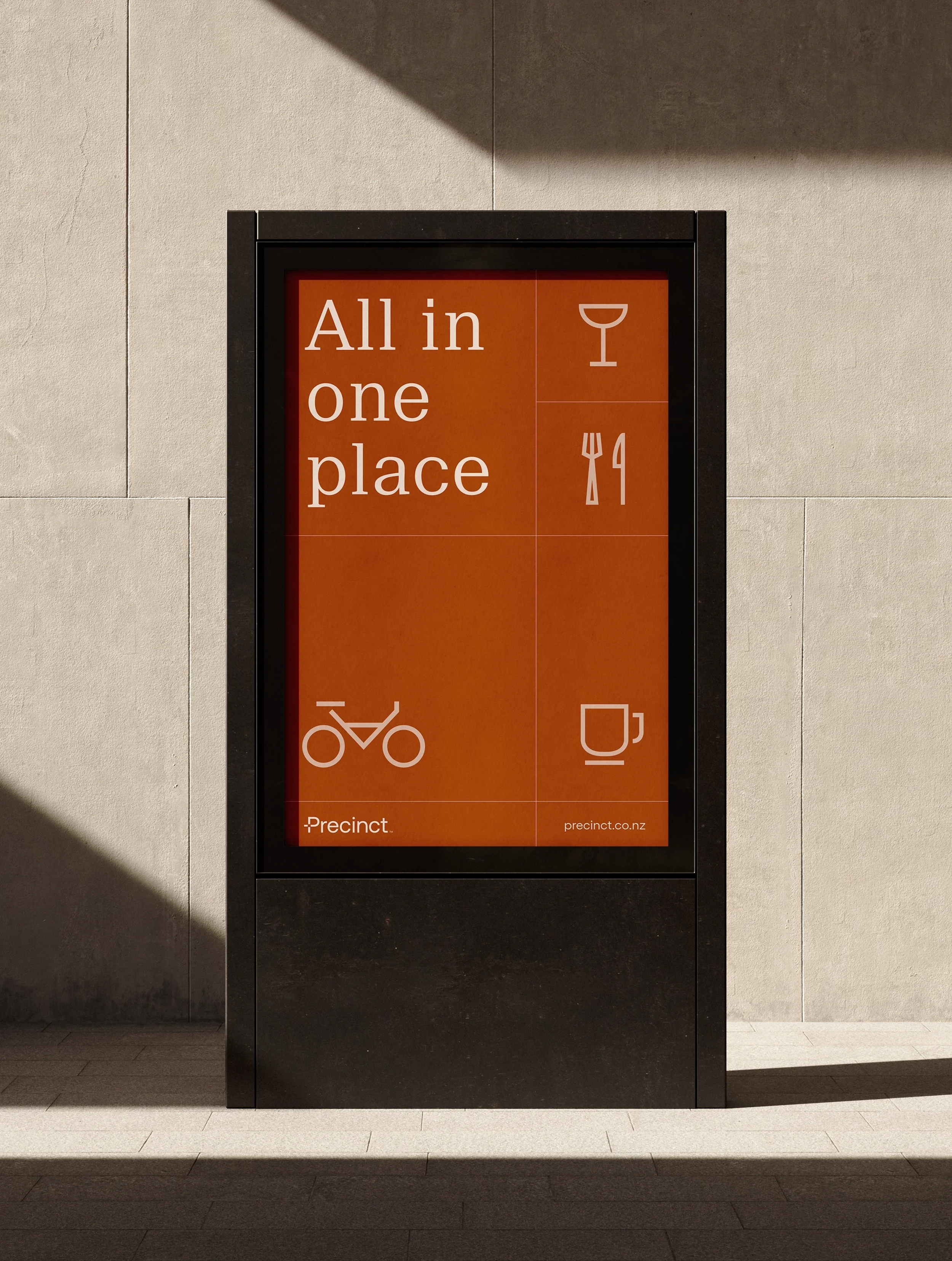
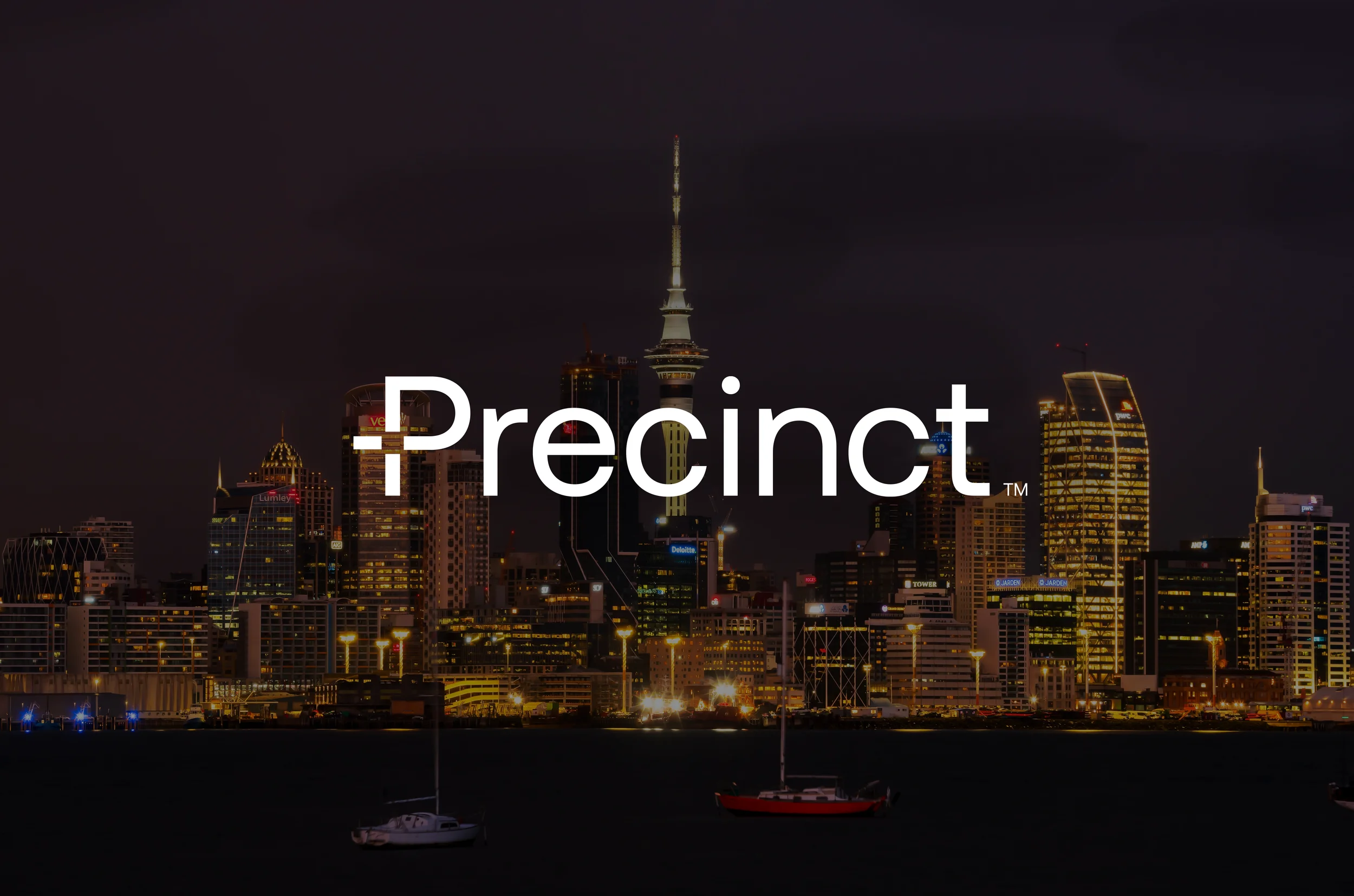
The core idea of Precinct's evolved visual identity is expressed in their "P" lettermark. The blank space at the centre represents a locus of connection, symbolising the places Precinct creates for people to congregate, collaborate, live, shop, dine, and more.
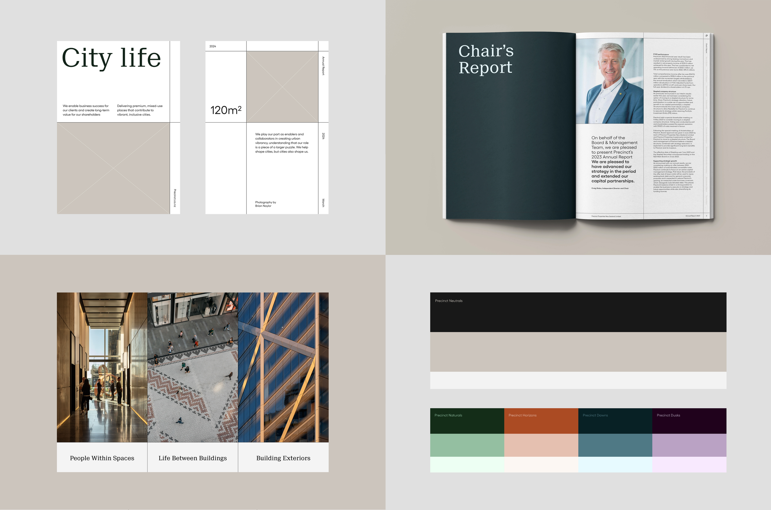
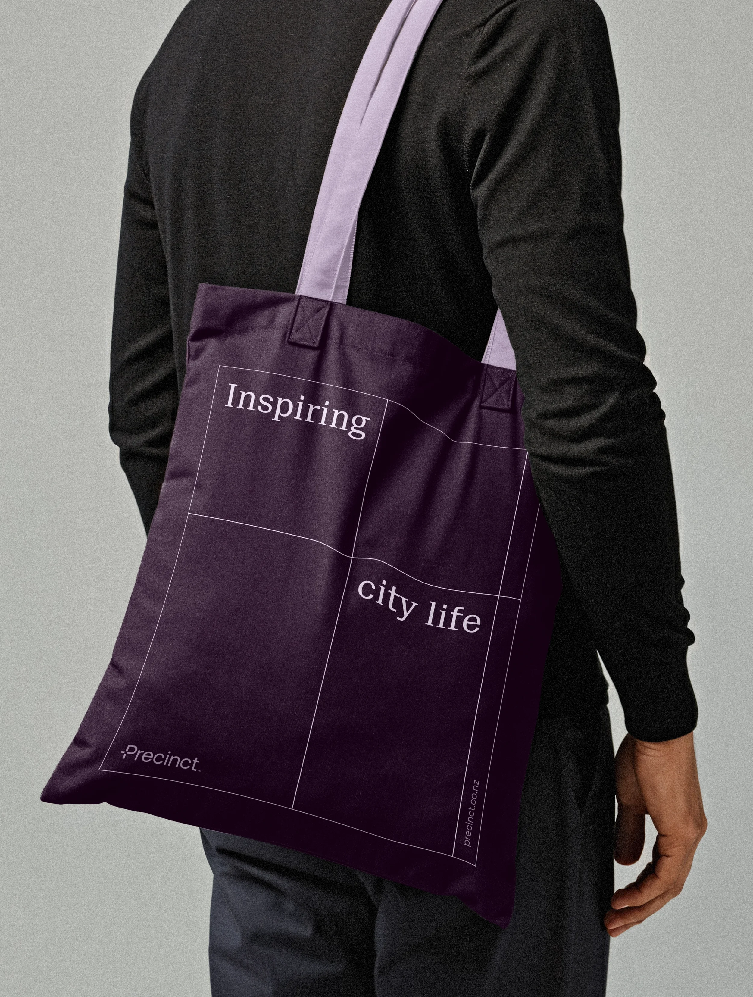
Reflecting their reputation for premium developments, Precinct's primary colour palette features a refined combination of warm black and grey. To support the diversity of Precinct's business verticals, these neutral colours are accompanied by a secondary palette of vibrant green, teal, purple, and orange.
Inspired by city planning, the identity is supported by a flexible grid system that serves as a unique visual identifier and a means of organising information. In keeping with their people-centric ethos, Precinct's photographic styling not only encapsulates buildings, but also how people inhabit those spaces and the life lived between buildings.
At the heart of this project was a sense of optimistic urbanism that crystallised through our collaboration with the team at Precinct. Their evolved brand identity was designed with a shared recognition that, as much as we shape cities, those cities inevitably shape us.
Brand Photography by Precinct